


Tote Bagger's Guide to LAABF
The Director's Cut

This week Artillery, LA’s longest running contemporary art magazine, published an article I wrote about my experience at the LA Art Book Fair—my first time having my art criticism in print !
It was a collaborative process throughout, and I benefited from the guidance of my editors Eileen Townsend and Daniela Soberman, who encouraged me to lean on my observational instincts and hone my focus.
A LOT of writing was left on the cutting room floor, de rigueur, and while I’m stoked to share the final cut, I’m also excited to assemble the scraps that didn’t make it to print. Behold the director’s cut !
I am an acolyte of Printed Matter’s vision. As an Artist Who Makes Books, and a punk educated through zines, PM is my church and I would die on its pyre. It set me on the path of book selling and self-publication, assuring me a lifelong mosaic of gig work. This year I worked Printed Matter’s LA Art Book Fair in exhibitor services, affording me a unique vantage from which to observe the action. My aim was to interview publishers and exhibitors about how and why artists’ books endure— burning my candle at both ends as a brand ambassador and roving journalist—with the tacit desire to flop in a pile of tote bags at the end of the four days.
Since its first iteration in 2013, the LA fair has been staged at Geffen MOCA. 2025 was LAABF’s maiden voyage at Art Center College, where it sprawled across multiple buildings, with programming tucked into classrooms and corridors. The cartography of the LA Art Book Fair is almost illegible. As an event, it overwhelms, a total phantasmagoria with no apparent center. Yes there are directional signs, but it cannot be read front to back. Visitors must develop individual strategies to find their way.
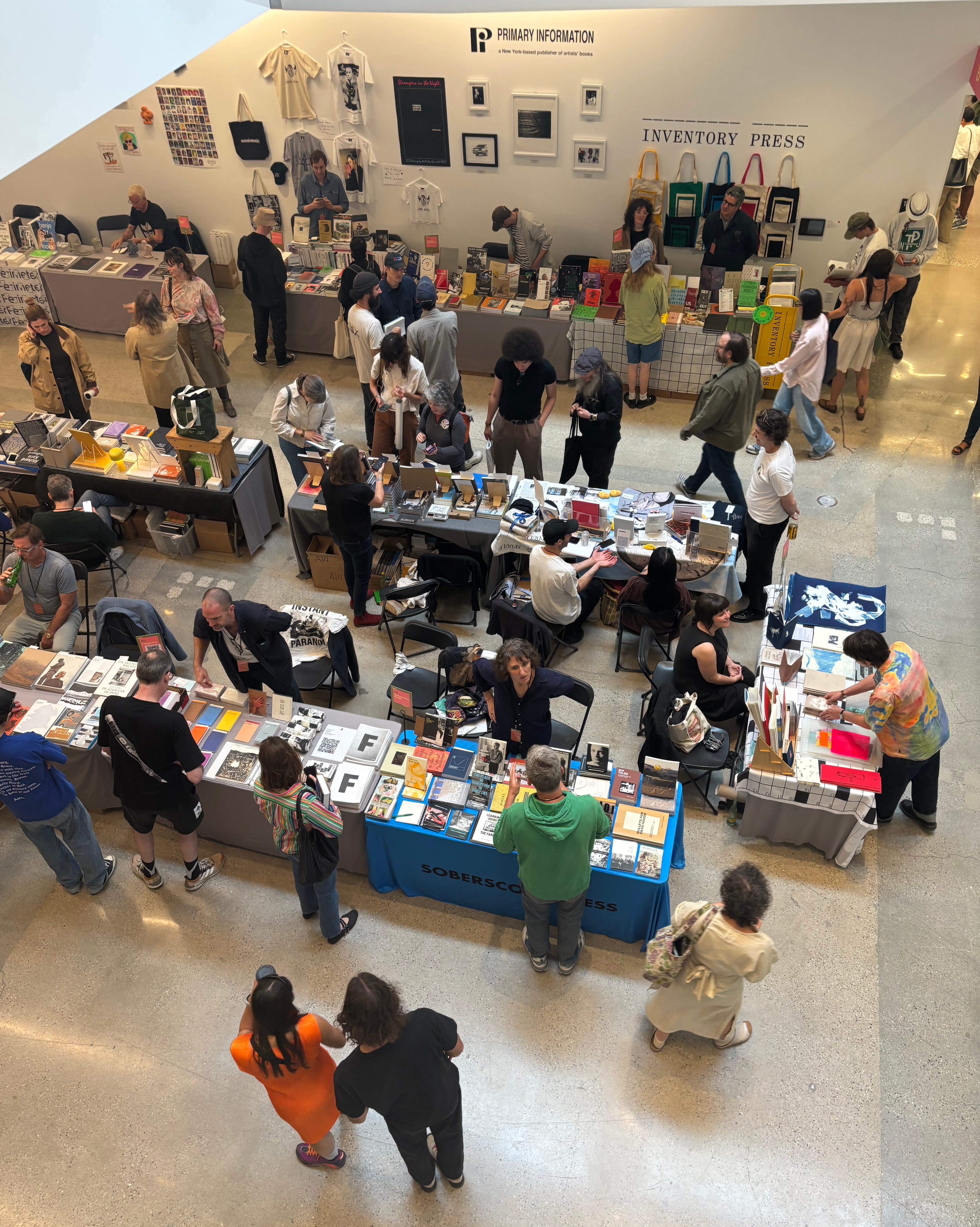
I propose a consideration of this year’s art book fair using tote bags as maps and interpretive tools of the event's major currents. Tote bags are everywhere at the fair. Useful for taxiing around one’s book haul, they represent so much more. They’re (relatively) affordable artist’s multiples, signifiers of waste consciousness, and brands of themselves. A New Yorker tote is identifiable for its typeface in any permutation; the texture of an IKEA bag is canon. LAABF is tote bag ground zero.
1.
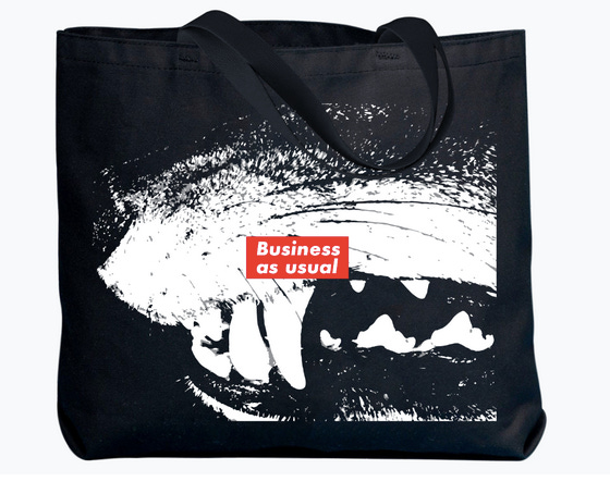
The Barbara Kruger Tote: an ample black bag with a high contrast graphic depicting a close cropped set of canine fangs with a slash of Kruger’s signature Futura text bearing “Business as usual.” The Barbara Kruger Tote represents an ongoing trend in objects and perspectives present at the LAABF: A focus on indexical, archival fine art effluvia.
Printed Matter’s founders were rooted in post-conceptualism, circulating artists’ books as an alternative to participation in the mainstream gallery system. This self-publishing impulse coincided with Mail Art and suited serial photo projects. Think Ed Ruscha’s books of California parking lots, or Eleanor Antin’s documents of 100 boots arranged across diverse geographic backdrops. This indexical strain is alive among the younger generations. Its influence can be seen in recent publications by Brendan Donnelly, Carolina Hicks, Alicia’s Klassic Kool Shoppe and Jessalyn Aaland, all of whom produce books of found objects —nostalgic packaging, collections of matchbooks and QSL radio cards, stickers— arranged in clean collages : tidy archives of consumption.

Semiotext(e) embodies the old guard of independent art book publishers. Whether they’ve been physically present at the fair, the press is spiritually interwoven with the Printed Matter project, having forged their own subversive literary platform with a roster of counterculture luminaries and continental philosophers whose influence is evident in the Cookie Mueller chapbooks and slim monochrome volumes by Jackie Wang and the Invisible Committee at the PM booth. But their cultural contributions aren’t universally appreciated, and the small publisher has to make up the difference creatively. At the fair on Friday, a series of George Bataille crop tops and yes– unadorned logo totes– displayed behind the booth for purchase. Editor Chris Kraus confided that Semiotext(e)’s NEA grant was rescinded this year, but that “Even before the NEA grant was rescinded, we’d planned to add t-shirts and tote bags to help cover [increased overhead] costs.”
To crib from an icon, when I hear the word culture I open my checkbook to attempt to support the presses that laid the foundation of my literary tastes. I deeply regretted not buying a crop top, if anyone has one let me know.
2.

The Fake New Yorker tote from Sybil Press: an enviable anti-design and avatar for the zine makers of LAABF. It’s a provisional version of the understated official logo, and it looks just like you’d imagine: cross hatched letters, seemingly scrawled in marker across an off white bag. The Fake New Yorker tote represents the DIY, punk ethos of the zine- makers for whom the LAABF is a yearly Mecca.
While the main buildings for the book fair aren’t split into specific echelons, there was a distinct zine zone between the 950 and 870 buildings, known as “Room K.” Room K is groovy.
Astraleyes, founder of Bibliomancers, an independent LA-based publisher “specializing in archival…vintage print design and its relationship to esoteric cultural movements” was in the thick of the zine action and reported on the scene:
“I was in what I call the ‘DJ classroom’ [courtesy of Orange Radio]. The live music brought super good vibes that made it feel like more of a party than a book fair.”
The camaraderie was palpable as I chatted with exhibitors, intermittently tablesitting so they could pee or grab cans of Canyon Cold Brew from an overstocked fridge in the lounge. In their absence I touched the saddle stitched and spiral bound publications, absorbing their essences– frisson from the hippy smut on yellowed newsprint at the StreetSalad Press table, forest warrior frequencies from a tiny facsimile of Rachel Carson’s Silent Spring. As Astraleyes put it: “Books are alive; they are a way to alter our states of consciousness.”
Maybe it was the livewire energy of the K Room that inspired me to ask exhibitors what the horniest book was. The denizens of Room K had answers. Denise Schatz from Miniature Garden nominated Casey Cook’s “Psychotic Erotic,” a book featuring rephotographed vintage porno images adorned/obscured by seashells in dialogue with the artist’s drawings. Variegated scallops and speckled rocks embellish dark thickets of pubic hair. It’s beautiful. These images were immediately flagged by Instagram when I attempted to share one on my stories, so they’re doing something right.

3.

David Kordansky Gallery Tote Bag: Starting Thursday, rumors circulated that this year’s design was “spicy.” When the tote finally made it onto the wall behind Kordansky’s booth, I was not disappointed. TWO spicy totes appeared: One featured a Ruby Neri image of a woman with a beatific grin brandishing her blobby orange ass. The other was an archetypal Tom of Finland design—chiseled beefcakes giving head, which begs for a great farmers market haul. The Kordansky Totes represented the high end galleries who lined the main floor of the 950 Building, publishing glossy artist monographs – massive high end tomes that make booksellers’ sciatic nerves squeal.
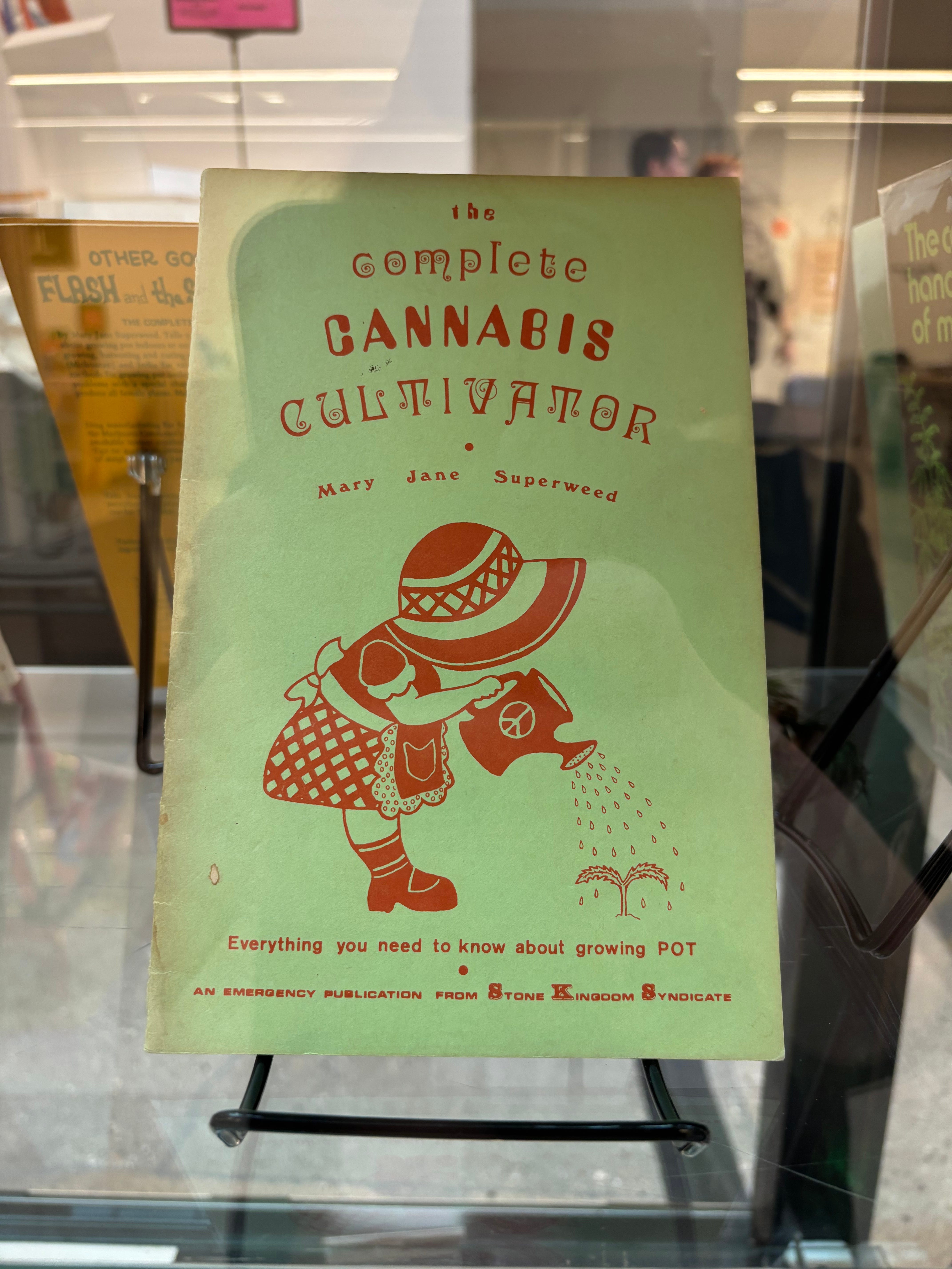
Though the adage “There’s No Money In Books” can be seen splashed across t-shirts at the fair thanks to Deadbeat Club, this section looked pretty posh. Angelenos swapped their billowy linen separates for form fitting garb, eccentric handbags and sculptural shoes. It was here that I spotted Malia Obama, Kathleen Hanna and Ad Rock shopping across from the vitrines full of vintage cannabis pamphlets and James Bond cars (a permanent fixture at Art Center). A towering Alice Coltrane exhibition catalogue clothbound in electric orange boards beamed from its display at the ArtBook booth, flanked by hefty publications on David Hammons and Hilma Af Klint. I ran into the artist Laura Soto drifting through an upstairs hallway in an iridescent slip, and we bonded over our twin purchases: stiff-billed dad hats that simply read “Grotto” in embroidered letters from the Marta booth.
But the 870 Building is the real cave of wonders. It’s packed with veteran exhibitors, international presses and purveyors of non-book objects. Artist Noah Lyon’s booth, tucked away on the building’s second floor, was populated with maximalist graphic tees adorned with an avalanche of band logos and elbow deep bins of one inch buttons. It faced off with exhibitors selling de-skilled ceramics adorned with the Crass logo and extravagant candlesticks from Two Birds One Key, the best smelling booth of the fair. My Sunday side quest revolved around retrieving material from Ediciones Concordia, a Mexico City Press, that a friend passed over the day before; FOMO was major currency here. I edged my way through the packed rooms and snagged two impeccably silkscreened drawing anthologies with die cut corners and metallic inlays. The friend explained that she hadn’t got a chance to browse them properly since the fair was such an “insane vortex of humans, but I bookmarked them in my head and looked them up. I felt I couldn’t appreciate the true texture of it digitally!”
4.
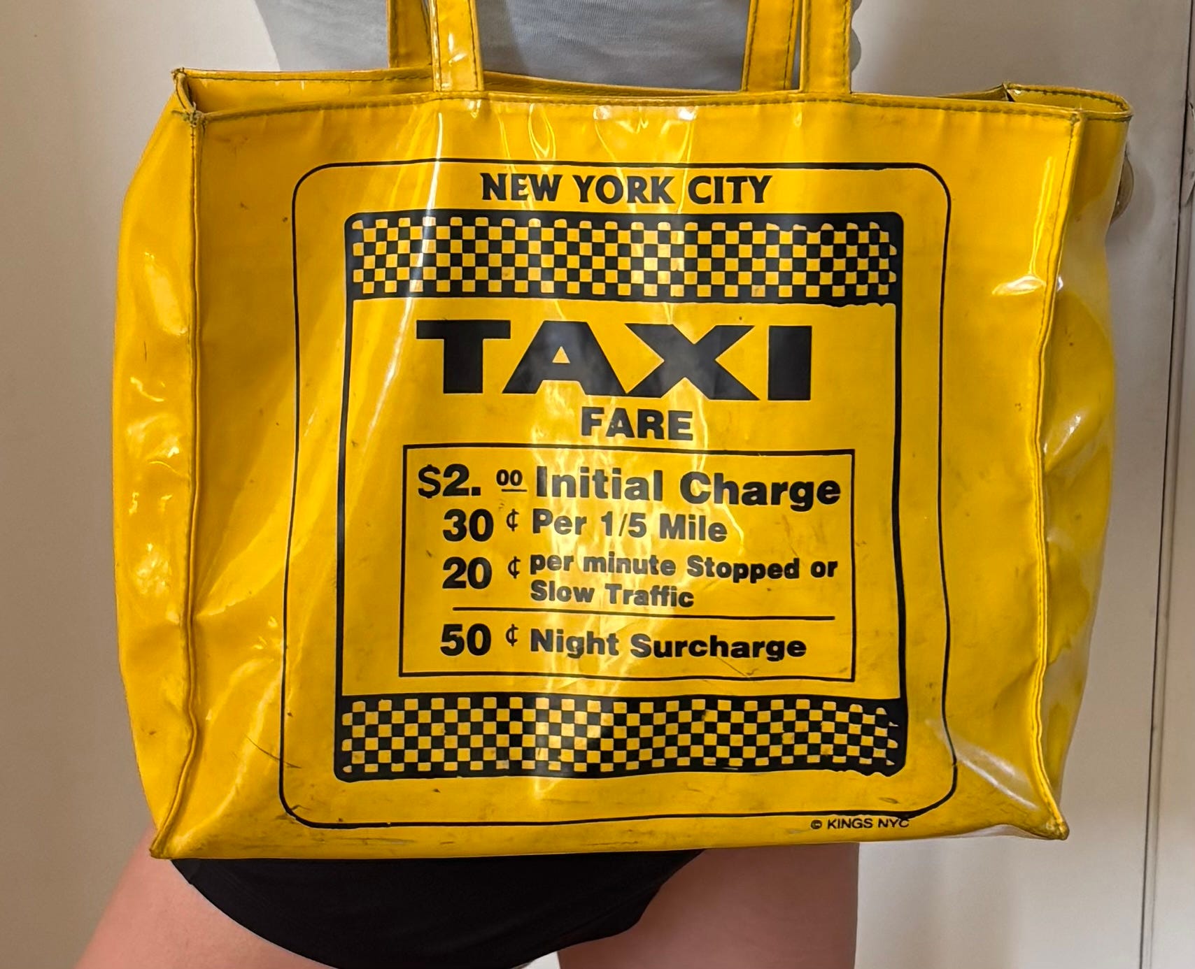
My Own Tote Bag: My own tote bag, a yellow vinyl novelty tote, ripped from 1980s Times Square and silk screened with the era’s taxi fares is the only tote bag that exceeds its symbolic, graphic exterior by virtue of the fact that…well, I know what is inside it. My tote bag represents my reprieve from the hyperlapse of the fair’s frantic externalities, into what the fair is all about: the books themselves. My own tote bag correlates to perhaps my favorite room of the fair, a Reading Room on the ground floor of 870, a reprieve from the masses into the pleasure of books, with installations acknowledging who isn’t here.
The Reading Room featured an installation I flipped through quietly as the Sunday melee died down. A book of bound paper scraps with deckled edges tethered to the wall contains scans of visa result documents from China–stamped, approved or under review–submitted by two artists who were unable to make the journey to LAABF due to repressive immigration policies.
Like the fair itself, the installation points to the difficulty of navigation but the faith – which sustains all us true believers – that printed matter can transgress borders.